Enhance your website's responsiveness with CSS viewport units. Create SEO-friendly designs tailored for various devices, optimizing user experiences.
vw (Viewport Width):
Represents a percentage of the viewport's width. For example, 50vw would be half the viewport width. 📏
vh (Viewport Height):
Represents a percentage of the viewport's height. It's handy for vertical responsiveness. 📐
vmin (Viewport Minimum):
Equal to the smaller of viewport width and height. Useful for elements that need to fit within the smaller dimension. 📦
vmax (Viewport Maximum):
Equal to the larger of viewport width and height. Useful for elements that need to span the larger dimension. 📈
===============================================
CSS Viewport Units
Why needs of new viewport units.
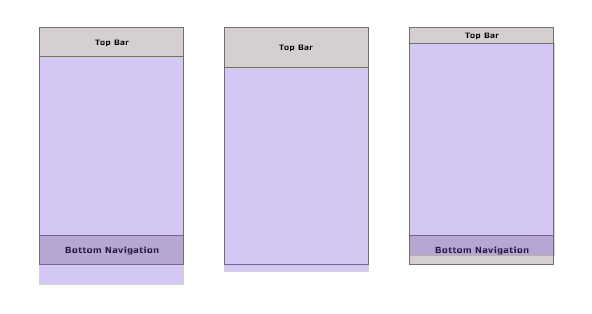
Problems with 100vh Height ports
Existing viewport 100vh hide content on different mobile device while toolbar added or expanded.
To solve this problem new viewport units comes on picture.
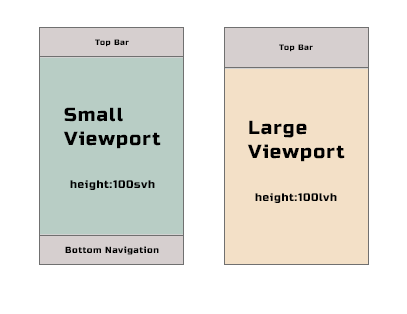
Large viewport have the lv prefix. The units are lvw, lvh, lvi, lvb, lvmin, lvmax.
Small viewport have the sv prefix. The units are svw, svh, svi, svb, svmin, svmax
This viewport-percentage units are fixed unless the viewport itself is resized.
So while viewport change it's hide content again when viewport changed.
Dynamic Height
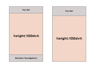
To solve Small and Large viewport issue , dynamic viewport comes on pictures.Dynamics viewport have the dv prefix. dvw, dvh, dvi, dvb, dvmin, dvmax.
When dynamic toolbars are expanded, viewport is equal to the size of the small viewport.
When dynamic toolbars are retracted, viewport is equal to the size of the large viewport.


